Sliding Sign-In and Sign-Up Component with Tailwind CSS
Sliding Sign-In and Sign-Up Component with Tailwind CSS
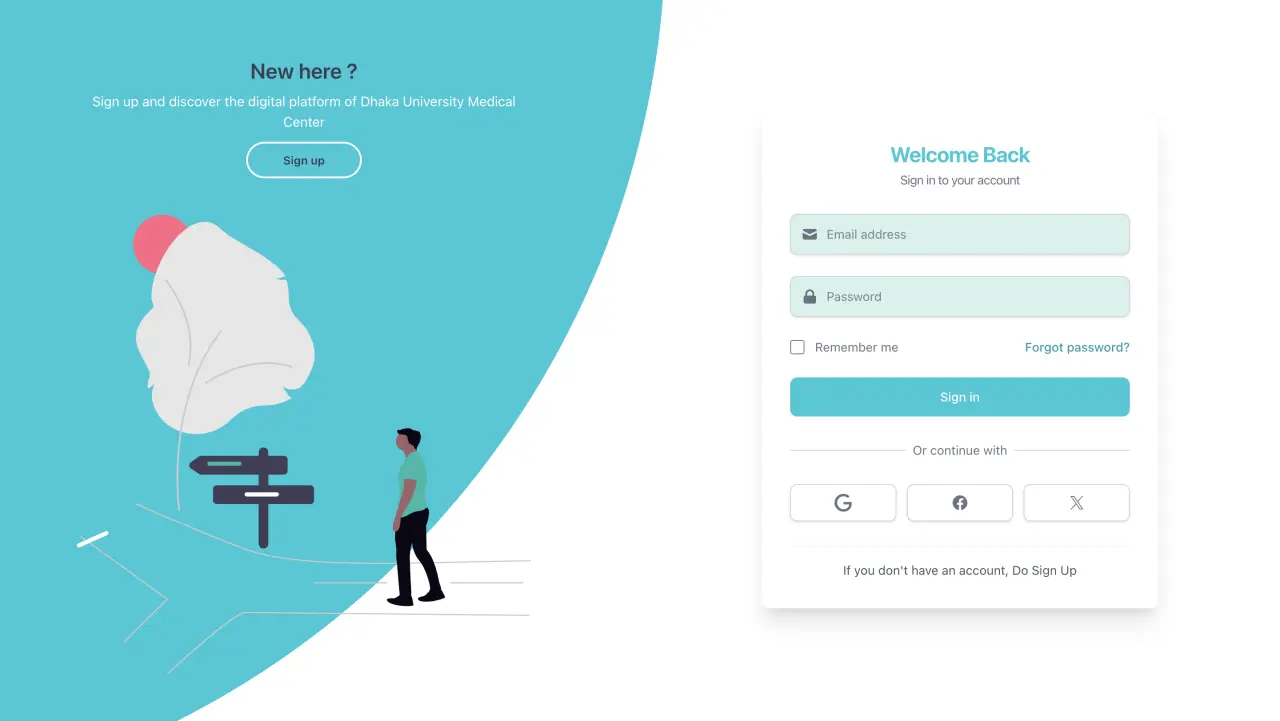
In this tutorial, we'll explore how to create a sliding sign-In and sign-up component with Tailwind CSS. This component will provide a smooth and interactive user experience, allowing users to toggle between sign-in and sign-up forms seamlessly. We'll leverage the power of React and Tailwind CSS to create a visually appealing and responsive design.
Features of Our Sliding Authentication Component
- Toggle between Sign In and Sign Up seamlessly
- Animated transitions for a smooth UX
- Responsive design for various screen sizes
- Clean, modern aesthetic with customizable colors
Quick Links
⭐ If you found this solution helpful, please consider giving this project a star on GitHub! Your support helps us continue developing useful tools.
Implementation
Let's start by creating our SlidingLoginSignup component.
Step 1: Setting the theme with Tailwind CSS
We will use Tailwind CSS to style our component. We will also add animations for the sliding effect.
/* global.css */
@import "tailwindcss";
@theme {
  /* Colors */
  --color-brightColor: #039bab;
  --color-backgroundColor: #03c9d7;
  --color-textColor: #333333;
}Step 2: Setting Up the Component
We will use React's useState hook to toggle between Sign In and Sign Up modes.
"use client";
import React, { useState } from "react";
import Image from "next/image";
import log from "@/public/signin.svg";
import register from "@/public/signup.svg";
import SignInForm from "./components/SignInForm";
import SignUpForm from "./components/SignUpForm";

const SlidingLoginSignup = () => {
  const [isSignUpMode, setIsSignUpMode] = useState(false);

  const toggleSignUpMode = () => {
    setIsSignUpMode(!isSignUpMode);
  };

  // Common button styles
  const buttonClasses =
    `w-full text-white bg-backgroundColor hover:bg-brightColor focus:ring-4 focus:outline-none
    focus:ring-primary-300 font-medium rounded-lg text-sm px-5 py-3 text-center transition-all
    duration-200 transform hover:scale-[1.02] hover:shadow-md`;
  const buttonForGFT =
    `inline-flex w-full justify-center items-center rounded-lg border border-gray-300 bg-white
    py-2.5 px-4 text-sm font-medium text-gray-500 hover:bg-gray-50 shadow-sm transition-all
    duration-200 hover:shadow hover:border-gray-400`;

  return (
    <div
      className={`relative w-full bg-white min-h-[100vh] lg:min-h-screen overflow-hidden
           before:content-[''] before:absolute before:w-[1500px] before:h-[1500px] lg:before:h-[2000px]
           lg:before:w-[2000px] lg:before:top-[-10%]  before:top-[initial] lg:before:right-[48%]
           before:right-[initial]  max-lg:before:left-[30%] max-sm:bottom-[72%]   max-md:before:left-1/2
            max-lg:before:bottom-[75%]  before:z-[6] before:rounded-[50%]    max-md:p-6
            lg:before:-translate-y-1/2  max-lg:before:-translate-x-1/2  before:bg-backgroundColor
            before:transition-all before:duration-[2s] lg:before:duration-[1.8s]  ${
        isSignUpMode
          ? `lg:before:translate-x-full before:-translate-x-1/2
          before:translate-y-full lg:before:right-[52%] before:right-[initial]  sm:max-lg:before:bottom-[22%]
           max-sm:before:bottom-[20%]  max-md:before:left-1/2`
          : ""
      }`}
    >
      <div className="absolute w-full h-full top-0 left-0">
        <div
          className={` absolute top-[95%] lg:top-1/2 left-1/2 grid grid-cols-1 z-[5] -translate-x-1/2
             -translate-y-full lg:-translate-y-1/2 lg:w-1/2 w-full  transition-[1s]  duration-[0.8s]
             lg:duration-[0.7s] ease-[ease-in-out] "  ${
            isSignUpMode
              ? "lg:left-1/4   max-lg:top-[-10%]   max-lg:-translate-x-2/4   max-lg:translate-y-0"
              : "lg:left-3/4 "
          } `}
        >
          <div
            className={` flex items-center justify-center flex-col   transition-all duration-[0.2s] delay-[0.7s]
              overflow-hidden col-start-1 col-end-2 row-start-1 row-end-2 px-20 max-lg:mt-60  z-20 max-md:px-6
              max-md:py-0 ${
              isSignUpMode ? " opacity-0 z-10 " : " "
            }`}
          >
            <SignInForm
              buttonClasses={buttonClasses}
              buttonForGFT={buttonForGFT}
            />
          </div>

          <div
            className={`flex items-center justify-center flex-col px-20 transition-all  ease-in-out duration-[0.2s]
               delay-[0.7s] overflow-hidden col-start-1 col-end-2 row-start-1 row-end-2 py-0 z-10 max-md:px-6
               max-md:py-0 opacity-0 ${
              isSignUpMode ? "opacity-100 z-20 " : "  "
            }`}
          >
            <SignUpForm
              buttonClasses={buttonClasses}
              buttonForGFT={buttonForGFT}
            />
          </div>
        </div>
      </div>

      <div className="absolute h-full w-full top-0 left-0 grid grid-cols-1   max-lg:grid-rows-[1fr_2fr_1fr]
      lg:grid-cols-2">
        <div
          className={`flex flex-row justify-around lg:flex-col items-center  max-lg:col-start-1 max-lg:col-end-2
            max-lg:px-[8%]   max-lg:py-10 lg:items-end  text-center z-[6]   max-lg:row-start-1 max-lg:row-end-2
             pl-[12%] pr-[17%] pt-12 pb-8 ${
            isSignUpMode ? "pointer-events-none" : " pointer-events-auto"
          }`}
        >
          <div
            className={`text-white transition-transform duration-[0.9s]  lg:duration-[1.1s] ease-[ease-in-out]
               delay-[0.8s] lg:delay-[0.4s]   max-lg:pr-[15%]  max-md:px-4  max-md:py-2 ${
              isSignUpMode
                ? "lg:translate-x-[-800px]   max-lg:translate-y-[-300px]"
                : ""
            }`}
          >
            <h3 className="font-semibold leading-none text-[1.2rem] lg:text-[1.5rem] text-gray-700">
              New here ?
            </h3>
            <p className="text-[0.7rem] lg:text-[0.95rem] px-0 py-2 lg:py-[0.7rem]">
            Sign up and discover our platform
            </p>
            <button
              className="bg-transparent w-[110px] h-[35px] text-gray-700 text-[0.7rem] lg:w-[130px] lg:h-[41px]
              lg:text-[0.8rem]  font-semibold   border-2 border-white rounded-full transition-colors duration-300
              hover:bg-white hover:text-gray-700"
              id="sign-up-btn"
              onClick={toggleSignUpMode}
            >
              Sign up
            </button>
          </div>

          <Image
            src={log}
            className={`  max-md:hidden max-lg:translate-y-[-40px] w-[200px] lg:w-full transition-transform
              duration-[0.9s] lg:duration-[1.1s] ease-[ease-in-out] delay-[0.6s] lg:delay-[0.4s] ${
              isSignUpMode
                ? "lg:translate-x-[-800px]   max-lg:translate-y-[-300px]"
                : ""
            }`}
            alt="login"
          />
        </div>
        <div
          className={`flex flex-row   max-lg:row-start-3 max-lg:row-end-4 lg:flex-col items-center lg:items-end
            justify-around text-center z-[6]   max-lg:col-start-1 max-lg:col-end-2  max-lg:px-[8%]   max-lg:py-10
             pl-[17%] pr-[12%] pt-12 pb-8 ${
            isSignUpMode ? " pointer-events-auto" : "pointer-events-none"
          }`}
        >
          <div
            className={`text-white transition-transform duration-[0.9s] lg:duration-[1.1s] ease-in-out delay-[0.8s]
               lg:delay-[0.4s]   max-lg:pr-[15%] max-md:px-4  max-md:py-2 ${
              isSignUpMode
                ? ""
                : "lg:translate-x-[800px]   max-lg:translate-y-[300px]"
            }`}
          >
            <h3 className="font-semibold leading-none text-[1.2rem] lg:text-[1.5rem] text-gray-700">
              One of us ?
            </h3>
            <p className=" py-2 text-[0.7rem] lg:text-[0.95rem] px-0  lg:py-[0.7rem]">
              Sign in to your account to have hastle free experience
            </p>
            <button
              className=" text-gray-700 bg-transparent w-[110px] h-[35px]  text-[0.7rem] lg:w-[130px]
              lg:h-[41px] lg:text-[0.8rem]  font-semibold   border-2 border-white rounded-full
              transition-colors duration-300 hover:bg-white hover:text-gray-700"
              id="sign-in-btn"
              onClick={toggleSignUpMode}
            >
              Sign in
            </button>
          </div>

          <Image
            src={register}
            className={`  max-md:hidden w-[200px] lg:w-full transition-transform duration-[0.9s]
              lg:duration-[1.1s] ease-[ease-in-out] delay-[0.6s] lg:delay-[0.4s] ${
              isSignUpMode
                ? ""
                : "lg:translate-x-[800px]  max-lg:translate-y-[300px]"
            }`}
            alt="register"
          />
        </div>
      </div>
    </div>
  );
};

export default SlidingLoginSignup;How It Works
Let's break down how this component functions:
- State Management: The
isSignUpModestate controls which form is displayed and the animation direction. - Animated Container: A large circular pseudo-element slides across the screen during transitions.
- Form Switching: Forms fade in and out based on the current mode.
- Responsive Design: The layout adjusts across different screen sizes using Tailwind's responsive utilities.
How is that animated circle formed?
🔵 1. The Circle is Created Using a ::before Pseudo-Element
In the outermost <div>, there's no actual <div> tag for the circle — it's made using Tailwind's support for ::before through utility classes.
Check this part:
before:content-['']
before:absolute
before:w-[1500px]
before:h-[1500px]
before:rounded-[50%]
before:bg-backgroundColorExplore CSS Pseudo Elements in Tailwind CSS
🔍 What this does:
before:content-['']: Makes sure the pseudo-element is rendered.before:absolute: Positions it freely within the parent.before:w-[1500px]&before:h-[1500px]: Huge dimensions to ensure the circle covers enough of the screen (especially on desktop).before:rounded-[50%]: Turns that big square into a perfect circle. As width and height are equal, therounded-[50%]makes it circular.before:bg-backgroundColor: Gives it color.
✅ Result: A large colored circle, sitting behind the form content.
🌀 2. The Circle is Positioned Using translate
Depending on screen size and the isSignUpMode state, the circle is moved using Tailwind’s translation utilities.
Example when isSignUpMode is true:
before:translate-y-full
lg:before:translate-x-full 🧠 What this means:
- The circle moves down or sideways out of the original spot to give a visual sliding effect.
- This creates a smooth animated transition between login and signup modes — like the UI is morphing.
🎯 3. Animation is Smooth Because of transition
Tailwind is also used to animate the movement:
before:transition-all
before:duration-[2s]
lg:before:duration-[1.8s]🎥 This tells the browser to animate all changes (like translate, opacity, etc.) smoothly over 1.8 to 2 seconds.
💡 Summary
So the animated circle works because of:
| Feature | Purpose |
|---|---|
::before | Creates a background shape |
w + h + rounded-[50%] | Makes it a circle |
absolute + translate | Moves it to specific locations |
transition-all + duration | Animates the movement smoothly |
Conditional Tailwind classes | Control movement based on mode (sign-in vs sign-up) |
Explore CSS Positioning in Tailwind CSS
Explore CSS Transform, Translate, and Transition in Tailwind CSS
Positioning
After forming the circle, the position is controlled entirely by utility classes (especially top, left, right, bottom, and translate modifiers) — and these change dynamically based on screen size and sign-up mode.
Let’s walk through it step-by-step.
🧩 Step 1: Initial Positioning (isSignUpMode is false)
Here’s the relevant part of the parent <div> when not in sign-up mode:
before:absolute
lg:before:top-[-10%]
lg:before:right-[48%]
max-lg:before:left-[30%]
max-md:before:left-1/2
max-lg:before:bottom-[75%]
lg:before:-translate-y-1/2
max-lg:before:-translate-x-1/2✅ What this does:
| Class | Meaning |
|---|---|
before:absolute | Let the circle be freely positioned within the relative container |
lg:before:top-[-10%] | Move the circle slightly above the visible area on large screens |
lg:before:right-[48%] | Push it a bit from the right on large screens |
max-lg:before:left-[30%] | On smaller screens, center it horizontally more |
max-lg:before:bottom-[75%] | Position it towards the bottom vertically on mobile |
translate-x, translate-y | Helps center the circle around a focal point instead of aligning from the top-left |
| Class | Effect |
|---|---|
-translate-y-1/2 | Moves up (negative Y direction) |
translate-y-1/2 | Moves down (positive Y direction) |
-translate-x-1/2 | Moves left (negative X direction) |
translate-x-1/2 | Moves right (positive X direction) |
So basically: it’s off-center and sitting behind the Sign In form, styled just enough to be visually appealing.
🔁 Step 2: Position Change When isSignUpMode is True
Now, look at this conditional block:
${isSignUpMode ?
  `lg:before:translate-x-full
   lg:before:-translate-y-1/2
   before:-translate-x-1/2
   before:translate-y-full
   lg:before:right-[52%]
   sm:max-lg:before:bottom-[22%]
   max-sm:before:bottom-[20%]
   max-md:before:left-1/2`
: ""}🔄 What’s changing here?
| Class | Effect |
|---|---|
lg:before:translate-x-full | Slides the circle all the way to the right on large screens |
before:translate-y-full | Moves the circle vertically down when not in Large Screen |
lg:before:right-[52%] | Re-positions the circle slightly more left from the right edge |
max-sm:before:bottom-[20%] | Adjust vertical position on small screens |
max-md:before:left-1/2 | Horizontally centers it on tablets/small screens |
🧠 These classes move the circle so that it visually supports the Sign Up form — which also slides in from the right.
Summary: How the Circle is Positioned
| State | How It's Positioned |
|---|---|
| Initial (Sign In) | Slightly off to the left/top using right-[48%] and top-[-10%], with Y-translate |
| Sign Up mode | Slides to the right (translate-x-full), down (translate-y-full), and adjusts right and bottom values |
| Responsive Design | Uses max-lg, max-md, max-sm to reposition the circle on smaller screens so the UX still works |
Wheel-Like Movement
The circle "feels" like it's rotating or rolling like a wheel, right? But here's the catch:
❗It's Actually an Illusion — Not Real Rotation!
Let me explain:
🌀 The Wheel-Like Movement — How It's Actually Implemented
In the code, there's no actual rotate or spinning transform applied to the ::before circle.
lg:before:translate-x-full
lg:before:-translate-y-1/2This means:
-
On large screens, the circle is primarily moving horizontally, not diagonally.
-
The
-translate-y-1/2is actually applied in both states (sign-in and sign-up), so there's no vertical change during the transition. -
Because it's a perfect circle and extremely large (2000px × 2000px on large screens), the horizontal movement creates an illusion of rolling.
🤯 Why It Feels Like Rotation
Here's what makes it feel like it's rotating:
| Visual Element | Illusion Trigger |
|---|---|
| ✅ Circle shape | A rolling circle is expected to spin |
| ✅ Large size relative to viewport | Only seeing part of the circle makes the movement seem more complex |
| ✅ Smooth easing + duration | The 1.8s transition mimics momentum like a wheel |
| ✅ Content shifting with it | Enhances motion illusion |
| ✅ Positioning adjustments | The slight shift from right-[48%] to right-[52%] enhances the motion |
Even without rotation or diagonal movement, our brain associates the horizontal motion of a massive circle with a rolling wheel. This is a clever visual trick that creates a sophisticated animation effect with simple CSS transforms.
On smaller screens, the behavior is different, using before:-translate-x-1/2 before:translate-y-full which creates a more vertical movement pattern.
What Happens After Positioning?
So far, we've covered:
- ✅ How the circle is created using
::before - ✅ How the circle is positioned initially for Sign In mode
- ✅ How it translates/moves for Sign Up mode using conditional classes
🧱 What Happens After the Circle Moves?
Once the circle is animated into its new position, it becomes part of a larger transition that gives the illusion of sliding between forms.
Let’s break down what happens next:
🧩 Form Panel Positioning — How Forms Slide With the Circle
After the circle moves...
<div className="absolute w-full h-full top-0 left-0">
  <div className={...}>
    <div className={isSignUpMode ? "opacity-0 z-10" : "opacity-100 z-20"}>
      <SignInForm />
    </div>
    <div className={isSignUpMode ? "opacity-100 z-20" : "opacity-0 z-10"}>
      <SignUpForm />
    </div>
  </div>
</div>Here’s what’s happening:
| Item | Effect |
|---|---|
opacity-0 / opacity-100 | Fades out one form and fades in the other |
z-10 / z-20 | Controls which form is clickable or visible on top |
translate-x, translate-y (from parent container) | Controls the sliding direction (left or right) |
So as the circle animates, the form container also shifts, syncing the visual experience.
🖼️ Side Panels (Text + Image) Animate Too
The two side panels — “New here?” and “One of us?” — also animate their content based on isSignUpMode.
Examples:
{isSignUpMode
  ? "lg:translate-x-[-800px]"
  : "lg:translate-x-[800px]"
}This means:
- The login image and text slide out to the left
- The sign-up image and text slide in from the right
So now:
- 🔵 The background circle shifts
- 🧩 The form panel slides and fades
- 🖼️ The side text panels animate out/in
All transitions happen together using:
translateopacitytransition-all,duration,delay- Conditional rendering based on
isSignUpMode
🎯 Final Result
It looks like the entire login/signup page morphs — but technically:
- The circle background shifts
- The forms fade and slide
- The side content swaps via translate
This gives your app a modern, smooth, and interactive transition between login and sign-up — and it’s all done purely with React + Tailwind, no animations libraries needed.
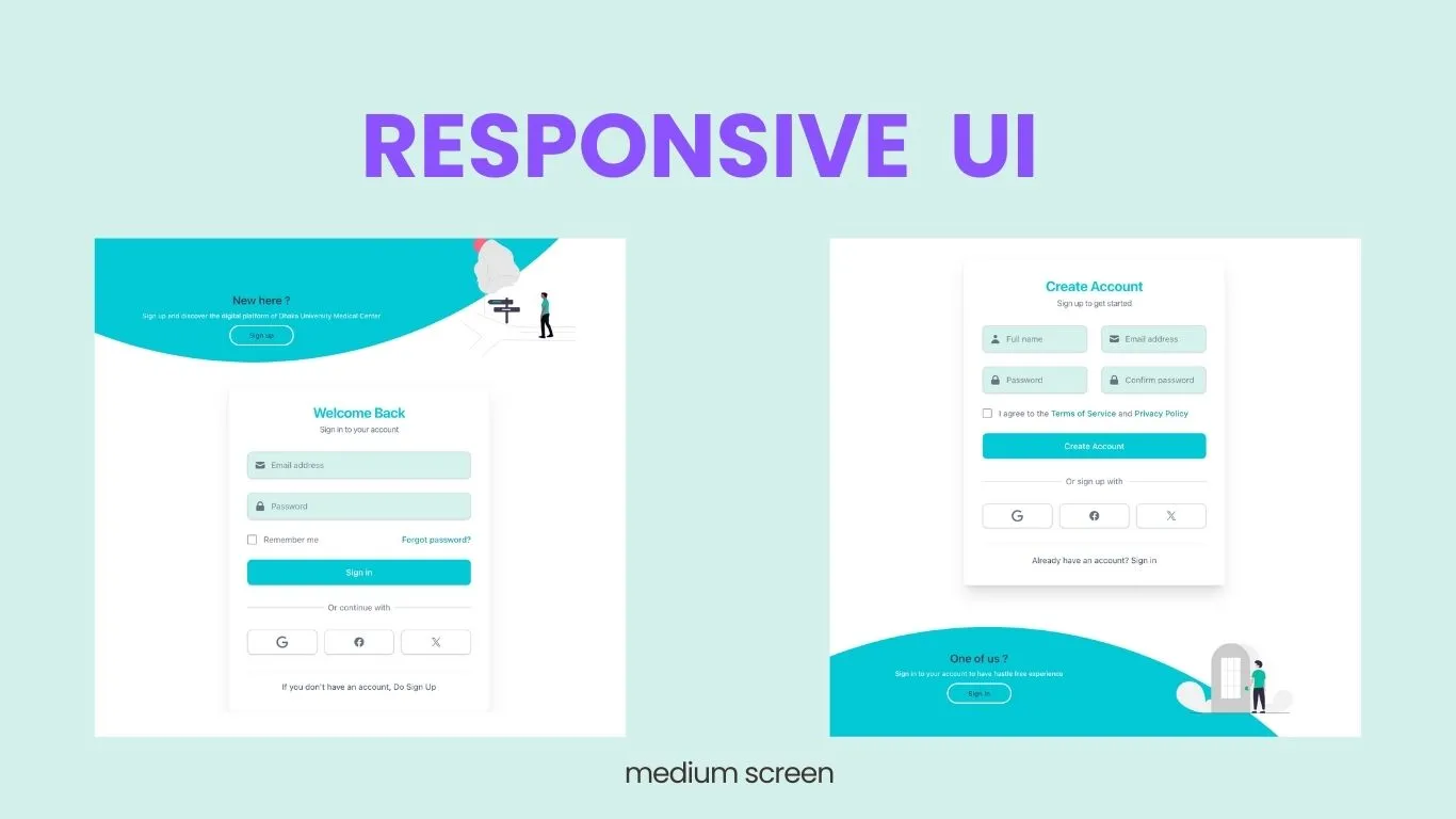
Responsive Design Showcase
The desktop layout features side-by-side panels with smooth horizontal transitions between modes.
Medium Screen View
On medium screens, the layout adjusts to ensure the content remains readable and visually appealing. The forms and buttons resize appropriately, and the sliding animations remain smooth.
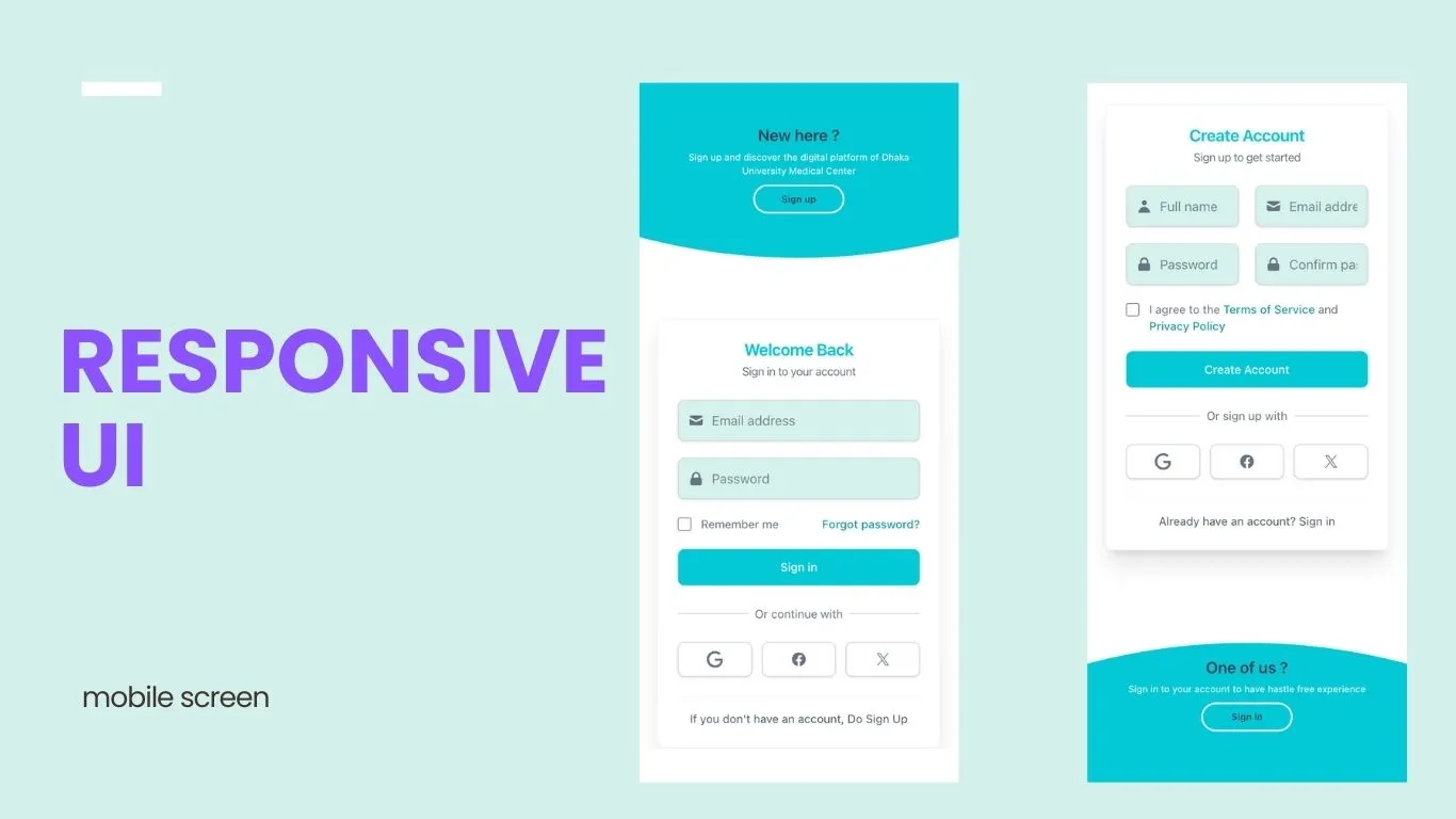
Mobile View
On small screens, the layout adapts with vertical stacking, ensuring the component remains functional and visually coherent on mobile devices.
Customization Options
You can easily customize this component to match your application's branding:
- Colors: Update the theme variables in
global.css - Images: Replace the SVG illustrations with your own assets
- Form Content: Add your own form fields, validation, and submission logic
- Animation Timing: Adjust the duration and ease values in the transition classes