CSS Positioning with Tailwind CSS
CSS Positioning with Tailwind CSS
In this blog post, we'll explore the concept of CSS Positioning with Tailwind CSS. Positioning is a fundamental aspect of web design that allows you to control the layout and placement of elements on a page. We'll cover the different types of positioning, their use cases, and provide practical examples using Tailwind CSS utility classes.
What is CSS Positioning?
Positioning in CSS controls how elements are placed in relation to their normal position in the document flow, their parent container, or the viewport. There are five main positioning values:
static- The default positioning (in the normal document flow)relative- Positioned relative to its normal positionabsolute- Positioned relative to its nearest positioned ancestorfixed- Positioned relative to the viewportsticky- A hybrid of relative and fixed positioning
Implementing Positioning with Tailwind CSS
Tailwind CSS provides intuitive utility classes for implementing positioning. Let's explore each type with practical examples.
Static Positioning (static)
Static is the default positioning for all HTML elements. Elements appear in the normal flow of the document.
<div className="static p-4 bg-gray-200 border border-gray-400">
  This is a statically positioned div (default behavior).
</div>Output:
By default, all elements have position: static. This means:
- The element stays in the normal document flow.
- It cannot be moved using
top,left,right, orbottom. - Other elements respect its position.
Example
<button className="px-6 py-3 bg-blue-500 text-white font-bold rounded pr-10">
  Click Me
  <span className="right-5 top-1/2 -translate-y-1/2"> → </span>
</button>Output:
💡 What Happens Here?
- The arrow (
→) inside<span>does not move to the right becauseright-5andtop-1/2requireposition: relativeorabsolute. Similarly,-translate-y-1/2requiresposition: absoluteorfixed. - Instead,
<span>stays in the normal flow, appearing right after the button text.
Explore CSS Transformations and Translations
Relative Positioning
Relative positioning positions an element relative to where it would normally appear in the document flow. Other elements behave as if the element were still in its original position.
<div className="relative p-4 bg-blue-100 border border-blue-400 left-4 top-2">
  This div is relatively positioned. It's moved 1rem to the right and 0.5rem
  down from its normal position.
</div>Output:
Relative positioning is also important because it establishes a positioning context for absolutely positioned child elements.
Absolute Positioning
Elements with absolute positioning are removed from the normal document flow. They're positioned relative to their nearest positioned ancestor (an element with positioning other than static), or to the document body if no positioned ancestor exists.
<div
  className="relative h-32 bg-gray-200 border border-gray-400 p-4 flex items-center justify-center"
>
  <p className="text-gray-800 text-sm text-center">
    Parent container (relative positioning)
  </p>

  <!-- Top-right box -->
  <div
    className="absolute top-0 right-0 w-40 h-20 bg-red-500 text-white p-2 text-xs flex items-center justify-center"
  >
    I'm positioned in the top-right corner of my parent
  </div>

  <!-- Bottom-left box -->
  <div
    className="absolute bottom-0 left-0 w-40 h-20 bg-blue-500 text-white p-2 text-xs flex items-center justify-center"
  >
    I'm positioned in the bottom-left corner of my parent
  </div>
</div>Output:
🔍 Summary of Positioning:
| Element | Positioning | Effect |
|---|---|---|
Parent (div) | relative | Becomes a reference for absolutely positioned children. |
Top-Right Box (div) | absolute top-0 right-0 | Moves to the top-right of the parent. |
Bottom-Left Box (div) | absolute bottom-0 left-0 | Moves to the bottom-left of the parent. |
Lets see the Button example again:
- Without positioning :
<button className="px-8 py-3 bg-blue-500 text-white font-bold rounded">
  Click Me
  <span className="right-1 top-1/2 -translate-y-1/2"> → </span>
</button>Output:
When you don't change the default static positioning, the utility classes like right-1, top-1/2, and -translate-y-1/2 have no effect. The arrow simply remains in line with the text.
- With positioning :
<button className="relative px-8 py-3 bg-blue-500 text-white font-bold rounded">
  Click Me
  <span className="absolute right-1 top-1/2 -translate-y-1/2">→</span>
</button>Output:
By adding relative to the button and absolute to the <span>, you enable the positioning utilities. The <span> is positioned relative to the button, so the arrow appears at the right side and is vertically centered.
Summary:
- Without positioning: The arrow appears as part of the text, without any offset.
- With positioning: The arrow is placed on the right side of the button and is vertically centered.
Explore CSS Transformations and Translations
Fixed Positioning
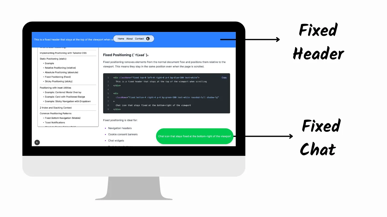
Fixed positioning removes elements from the normal document flow and positions them relative to the viewport. This means they stay in the same position even when the page is scrolled.
<div className="fixed top-0 left-0 right-0 p-4 bg-blue-500 text-white">
  This is a fixed header that stays at the top of the viewport when scrolling
</div>

<div
  className="fixed bottom-4 right-4 p-4 bg-green-500 text-white rounded-full shadow-lg"
>
  Chat icon that stays fixed at the bottom-right of the viewport
</div>- The visualization of the above code is shown through an image below:
You can see the fixed header at the top and the chat icon at the bottom-right of the viewport.
Output:
Fixed positioning is ideal for:
- Navigation headers
- Cookie consent banners
- Chat widgets
- Back-to-top buttons
- Floating action buttons
Sticky Positioning
Sticky positioning is a hybrid between relative and fixed positioning. The element is treated as relative until it crosses a specified threshold, then it's treated as fixed.
<div className="h-96 overflow-y-auto border border-gray-300">
  <div className="p-4 bg-gray-100">Some content above</div>
  <div className="sticky top-0 p-4 bg-yellow-300 z-10">
    I'm a sticky header - I'll stick to the top when scrolled
  </div>
  <div className="p-4 h-96 bg-gray-100">
    Scroll me to see the sticky header in action
  </div>
</div>Output:
Sticky positioning works great for:
- Section headers in long lists
- Category navigation in e-commerce
- Table headers
- Persistent filter controls
Z-Index and Stacking Context
When working with positioned elements, controlling the stacking order becomes crucial. Tailwind provides z-{index} utilities to manage which elements appear on top.
<div className="relative h-32 w-full">
  <div className="absolute left-0 top-0 h-24 w-24 bg-blue-500 z-10"></div>
  <div className="absolute left-8 top-8 h-24 w-24 bg-red-500 z-20"></div>
  <div className="absolute left-16 top-16 h-24 w-24 bg-green-500 z-30"></div>
</div>Output:
The elements with higher z-index values appear on top. Tailwind provides values from z-0 to z-50, with additional utilities like z-auto and z-negative.
Absolute Center (Using Grid)
<div className="relative h-64 bg-gray-100">
  <div className="absolute inset-0 grid place-items-center">
    <div className="bg-white p-6 rounded shadow-lg">
      I'm perfectly centered using Grid!
    </div>
  </div>
</div>Output:
- The grid container enables the place-items-center utility to center the child element both horizontally and vertically.
Absolute Center (Using Transform)
<div className="relative h-64 bg-gray-100">
  <div
    className="absolute top-1/2 left-1/2 transform -translate-x-1/2 -translate-y-1/2 bg-white p-6 rounded shadow-lg"
  >
    I'm perfectly centered using transform!
  </div>
</div>Output:
Explore CSS Transformations and Translations
Conclusion
CSS positioning is a powerful tool for creating complex layouts and UI components. With Tailwind CSS, implementing these positioning techniques becomes more intuitive and maintainable through the use of utility classes.
Remember these key points when working with positioning in Tailwind:
- Use
relativepositioning to establish a positioning context for absolute elements - Use
absolutepositioning for elements that need to be placed precisely within a container - Use
fixedpositioning for elements that should stay in place regardless of scrolling - Use
stickypositioning for elements that should switch between relative and fixed behavior - Combine positioning with Tailwind's other utilities (flex, grid, transitions) for complex UI patterns
By mastering CSS positioning with Tailwind, you'll be able to create more sophisticated layouts and components while maintaining clean, readable code.
Happy coding!